Hope that you enjoyed my last visualization, Introducing The #RyanSleeperChallenge.
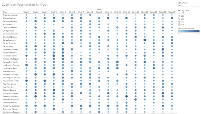
The next visualization is a heat map. The heat map is similar to the highlight table, but the heat map will allow you to view two measures with 2 different mark types. In addition to being able to show color (like the highlight table), I added in size on the same dimensions. For this visualization, I looked at 2018 National Football League data (from Pro Football Reference) and wanted to look at pass completions and passing yards for each team by week. I put completions on the color mark and then added passing yards to the size mark. I also added a filter to see if certain teames were better at home or away. In the tooltip I added the opponent and if they were home or away when they played the game. If you click on a team name, it will highlight their stats and gray out the other teams so you can focus.
Here is the link to the Tableau page so that you can interact and see what you find interesting.
Heat Map for 2018 NFL Passing Stats by Week